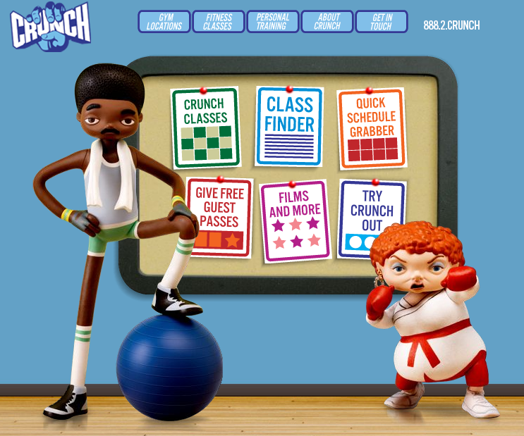
 Crunch is a fitness site with a difference - they break the typical mould used by similar businesses in this genre to create a colourful yet not overly done visual aesthetic. Some might say they have missed the mark but I say they create interest in their deviation from the norm and combined with the simple menu structure, make it enjoyable to navigate around their site, to get what you want fast.
There are several obvious references to their business type even in the cartoon style graphic:
- floorboards tie in nicely to the gymnasium connection
- gym equipment placed in the hands of the characters
- even the towel draped around the neck of Mr Cool sends a signal to the brain that says "sweaty men trying to workout"
My criticism lies in the fact that they didn't take this style to the bank - why don't these characters appear elsewhere in the site. So often, a designer will go to the trouble of cleverly designing and generating visual elements such as these comic characters, only to underutilise them by only placing them on the front page. Why?
All in all, a very creative spin on websites for the fitness freaks in the world - of which I am certainly not one!
