While I think much more could be done to improve this site, the lesson remains that choosing a single image well can make a world of difference and indeed, an otherwise dull experience can have a spark of colour and a third dimension. A good lesson learned.
Sunday, August 26, 2007
3, 2, 1 .... Vivid Photo Lift Off!!!
While I think much more could be done to improve this site, the lesson remains that choosing a single image well can make a world of difference and indeed, an otherwise dull experience can have a spark of colour and a third dimension. A good lesson learned.
Saturday, August 11, 2007
Funtastic Movie-like Graphic Design Effects
This is the stuff that adds spruce and excitement to web pages - the odd image makeover based on step by step tutorials found ever so commonly on the web. These days it doesn't take too many steps to add character to a picture and these photo effects that match movie styling with Illustrator and Photoshop techniques are no exception.
My thinking is that when you combine original images with these techniques you create millions of variations that break the generic look the web sometimes takes. As an added bonus, the Photojojo site is both full of great graphic design advice and designed itself creatively with a fresh twist on header backgrounds born from a tea-towel pattern.
Great design teaching about great design - gotta love these web gems!
Thursday, July 19, 2007
Take Design Variations to the Bank
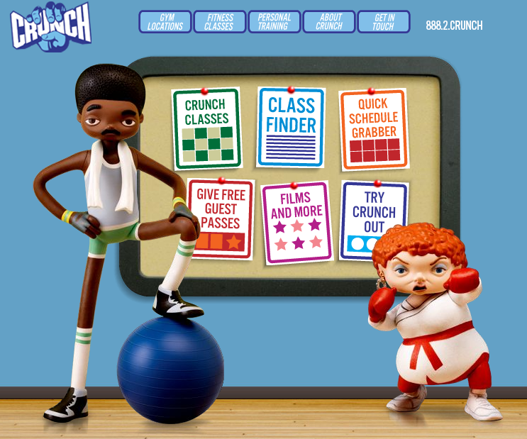
 Crunch is a fitness site with a difference - they break the typical mould used by similar businesses in this genre to create a colourful yet not overly done visual aesthetic. Some might say they have missed the mark but I say they create interest in their deviation from the norm and combined with the simple menu structure, make it enjoyable to navigate around their site, to get what you want fast.
There are several obvious references to their business type even in the cartoon style graphic:
- floorboards tie in nicely to the gymnasium connection
- gym equipment placed in the hands of the characters
- even the towel draped around the neck of Mr Cool sends a signal to the brain that says "sweaty men trying to workout"
My criticism lies in the fact that they didn't take this style to the bank - why don't these characters appear elsewhere in the site. So often, a designer will go to the trouble of cleverly designing and generating visual elements such as these comic characters, only to underutilise them by only placing them on the front page. Why?
All in all, a very creative spin on websites for the fitness freaks in the world - of which I am certainly not one!
Wednesday, July 4, 2007
Who said CMS templates had to be boxy?
This template by a company called JoomlaArt displays the qualities I knew were possible in Joomla template design but to date haven't seen come to fruition. Placement of images in such a creative way to provide some alternate line directions to the standard column shape of a typical content management system means that the content can be less obtrusive in the overall feel of the site. A nice job indeed. Now I want a similar level of creativity shown in Moodle theme design, especially in the area of a K-6 school.
Friday, June 22, 2007
Simple software wins, again....
From the makers of the award winning Comic Life software comes the soon to be released Skitch graphics program and online web 2.0 MySkitch site. Having watched th video I relised how handy this tool would be - mainly for its simple methods for doing what many of us do with a more complicated package such as Fireworks or Photoshop.
In fact, I liken it to shooting a tin can with a sherman tank, when it comes to 90% of the graphic manipulation that bloggers and average web authors require each day.
Have a watch of the awesome demo video to make up your own mind. A win for more usable web authoring I say!
In fact, I liken it to shooting a tin can with a sherman tank, when it comes to 90% of the graphic manipulation that bloggers and average web authors require each day.
Have a watch of the awesome demo video to make up your own mind. A win for more usable web authoring I say!
Subscribe to:
Posts (Atom)
