Saturday, November 28, 2009

Weekend Operation: Oz Twitterers Help Hockey Decide on ETS & Liberal Leadership

It started on Friday 27 November when Joe Hockey posted a 9:40am message on the social blogging site Twitter: "Hey team re The ETS. Give me your views please on the policy and political debate. I really want your feedback."

The ETS is the Emissions Trading Scheme being proposed by the Rudd government in Australia.

The next morning the Sydney newspapers were adding fuel to the fire by mentioning Mr Hockey's 'tweet' and soon hundreds from both sides of the environmental and political fence were offering their take on the situation.

That's when I had this brilliant (self labelled) idea over my Saturday morning coffee - let's aggregate all the tweets mentioning @joehockey since the initial post on Friday and see what the punters actually say. A quasi 'Twitter Pollie Poll' had commenced and I was certain there was value in the people's opinion.

Here is the pie chart showing percentage of tweets that had an opinion either for or against the Turnbull/Labor ETS deal:


My Method:
In order to generate the above graph the following steps and decisions were made:
  • Twitter's search feature was used (via the API) to download all 1500 tweets made since Friday and containing the @joehockey text.
  • This data was processed using a script to generate a spreadsheet of all Twitter messages along with the time they were published and the Twitter screen name of the message author.
  • The spreadsheet was then sorted to display any duplicate authors.
  • A rating scale was applied to every tweet to reflect the opinion of the author or whether the tweet should be excluded: Yes, No, Duplicate exclusion, Retweet exclusion, No opinion exclusion.
  • The resulting totals were used to generate the pie chart displayed above.
Considerations:
In order to decide on the value of each opinion I focussed on the central question asked by Mr Hockey, with a slight editorial licence: "Should the Liberal party pass the ETS in it's amended form through the parliament and in doing so support Mr Turnbull's position?"

Interesting Opinions:
As is often the case, the public voice contained many fascinating and sometimes insightful trends:
  • The ETS is seen by many supporters as not perfect but better than inaction.
  • ETS detractors claim that the average person will pay for big business pollution should the scheme be enacted in parliament.
  • Joe Hockey's potential leadership challenge against Malcolm Turnbull was seen by many as more interesting to discuss than the ETS.
  • A 'wait for the Copenhagen Convention' message was evident throughout the tweets.
The prize for the funiest tweet goes to troymac79 who said, "Go for the leadership ur our big cuddly teady bear."

The public have had a rare opportunity to voice their opinions and let's hope Joe Hockey and other political leaders choose to take some of these messages on board when deciding on this important environmental deal.

Tuesday, October 6, 2009

500+ Named colors (colours) help with design decisions

The hex values and RGB values given on the Named Colors website come in very handy when you are designing a website. I found myself browsing down the vertical array of colours and selecting by sight the "kinda" colour I was looking for before copying the hex value for my CSS style.

Sometimes it's hard to slide sliders in graphic program or pinpoint the exact spot on teh colour wheel to discover the look you are after. Having the colours spread down a page with value beside them for over 500 colours comes in very handy - bookmark this one for a day of colour hunting!

Sunday, August 26, 2007

3, 2, 1 .... Vivid Photo Lift Off!!!

The "Guide to Coaching Basketball" website is a pre- dominately textual experience, especially on the front page. But there is one saving grace that provides a lesson in effective image selection - a single vivid image of a basketball. With the leather texture, coupled with a realistic shadow under the ball (possibly added afterward), the ball provides an amazing amount of lift for such a plain website.

While I think much more could be done to improve this site, the lesson remains that choosing a single image well can make a world of difference and indeed, an otherwise dull experience can have a spark of colour and a third dimension. A good lesson learned.

Saturday, August 11, 2007

Funtastic Movie-like Graphic Design Effects

clipped from photojojo.com
photoshop photos for movie effects
This is the stuff that adds spruce and excitement to web pages - the odd image makeover based on step by step tutorials found ever so commonly on the web. These days it doesn't take too many steps to add character to a picture and these photo effects that match movie styling with Illustrator and Photoshop techniques are no exception.

My thinking is that when you combine original images with these techniques you create millions of variations that break the generic look the web sometimes takes. As an added bonus, the Photojojo site is both full of great graphic design advice and designed itself creatively with a fresh twist on header backgrounds born from a tea-towel pattern.

Great design teaching about great design - gotta love these web gems!

Thursday, July 19, 2007

Take Design Variations to the Bank

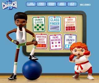
Crunch is a fitness site with a difference - they break the typical mould used by similar businesses in this genre to create a colourful yet not overly done visual aesthetic. Some might say they have missed the mark but I say they create interest in their deviation from the norm and combined with the simple menu structure, make it enjoyable to navigate around their site, to get what you want fast.

There are several obvious references to their business type even in the cartoon style graphic:

  • floorboards tie in nicely to the gymnasium connection

  • gym equipment placed in the hands of the characters

  • even the towel draped around the neck of Mr Cool sends a signal to the brain that says "sweaty men trying to workout"

I also love the captions for the two characters that popup on mouseover. Nice touch.

My criticism lies in the fact that they didn't take this style to the bank - why don't these characters appear elsewhere in the site. So often, a designer will go to the trouble of cleverly designing and generating visual elements such as these comic characters, only to underutilise them by only placing them on the front page. Why?

All in all, a very creative spin on websites for the fitness freaks in the world - of which I am certainly not one!

Wednesday, July 4, 2007

Who said CMS templates had to be boxy?

 blog it
This template by a company called JoomlaArt displays the qualities I knew were possible in Joomla template design but to date haven't seen come to fruition. Placement of images in such a creative way to provide some alternate line directions to the standard column shape of a typical content management system means that the content can be less obtrusive in the overall feel of the site. A nice job indeed. Now I want a similar level of creativity shown in Moodle theme design, especially in the area of a K-6 school.

Friday, June 22, 2007

Simple software wins, again....

clipped from plasq.com
My Skitch
 blog it
From the makers of the award winning Comic Life software comes the soon to be released Skitch graphics program and online web 2.0 MySkitch site. Having watched th video I relised how handy this tool would be - mainly for its simple methods for doing what many of us do with a more complicated package such as Fireworks or Photoshop.

In fact, I liken it to shooting a tin can with a sherman tank, when it comes to 90% of the graphic manipulation that bloggers and average web authors require each day.

Have a watch of the awesome demo video to make up your own mind. A win for more usable web authoring I say!